ShopDreamUp AI ArtDreamUp
Deviation Actions
Daily Deviation
Daily Deviation
December 3, 2010
dA Piece by Piece : CSS + Box by =ziinyu is a very detailed tutorial that explains all the single bits of the journal CSS code.
No matter if you are new to CSS or have already made several skins, this is something you all should take a look at.
[dA related > deviantART Tutorials]
No matter if you are new to CSS or have already made several skins, this is something you all should take a look at.
[dA related > deviantART Tutorials]
Featured by GinkgoWerkstatt


![Figure / Life (Drawing) [07] Euan](https://images-wixmp-ed30a86b8c4ca887773594c2.wixmp.com/f/a8656cef-43f6-4f1b-a46e-8e5db6c1036f/d5mln9l-0fd7bd61-d16a-4ce9-9340-731b7a1fb1f1.png/v1/crop/w_92,h_92,x_0,y_0,scl_0.0368,q_70,strp/figure___life__drawing___07__euan_by_ziinyu_d5mln9l-92s.jpg?token=eyJ0eXAiOiJKV1QiLCJhbGciOiJIUzI1NiJ9.eyJzdWIiOiJ1cm46YXBwOjdlMGQxODg5ODIyNjQzNzNhNWYwZDQxNWVhMGQyNmUwIiwiaXNzIjoidXJuOmFwcDo3ZTBkMTg4OTgyMjY0MzczYTVmMGQ0MTVlYTBkMjZlMCIsIm9iaiI6W1t7ImhlaWdodCI6Ijw9MTAyNCIsInBhdGgiOiJcL2ZcL2E4NjU2Y2VmLTQzZjYtNGYxYi1hNDZlLThlNWRiNmMxMDM2ZlwvZDVtbG45bC0wZmQ3YmQ2MS1kMTZhLTRjZTktOTM0MC03MzFiN2ExZmIxZjEucG5nIiwid2lkdGgiOiI8PTEwMjQifV1dLCJhdWQiOlsidXJuOnNlcnZpY2U6aW1hZ2Uub3BlcmF0aW9ucyJdfQ.0vX-JNbCn6aZ70JgfQsIkBSyMmPlT5DZOuhko67-FHg)


Suggested Deviants


Suggested Collections
![[Custom Box Code] Black Scroll Boxes](https://images-wixmp-ed30a86b8c4ca887773594c2.wixmp.com/f/f9d3f707-badf-4eba-a9f9-7e67baae16d6/d7qukbi-67a0045d-65af-440e-9db1-18032bb5781c.png/v1/crop/w_184,h_184,x_20,y_0,scl_0.41818181818182,q_70,strp/_custom_box_code__black_scroll_boxes_by_valognir_d7qukbi-92s-2x.jpg?token=eyJ0eXAiOiJKV1QiLCJhbGciOiJIUzI1NiJ9.eyJzdWIiOiJ1cm46YXBwOjdlMGQxODg5ODIyNjQzNzNhNWYwZDQxNWVhMGQyNmUwIiwiaXNzIjoidXJuOmFwcDo3ZTBkMTg4OTgyMjY0MzczYTVmMGQ0MTVlYTBkMjZlMCIsIm9iaiI6W1t7ImhlaWdodCI6Ijw9NDQwIiwicGF0aCI6IlwvZlwvZjlkM2Y3MDctYmFkZi00ZWJhLWE5ZjktN2U2N2JhYWUxNmQ2XC9kN3F1a2JpLTY3YTAwNDVkLTY1YWYtNDQwZS05ZGIxLTE4MDMyYmI1NzgxYy5wbmciLCJ3aWR0aCI6Ijw9NjI3In1dXSwiYXVkIjpbInVybjpzZXJ2aWNlOmltYWdlLm9wZXJhdGlvbnMiXX0.OaQLPK8MFhmQELXcDarIYFBHzKMlXRUWEHWbA36umiw)
![[Custom Box Code] Black Scroll Boxes](https://images-wixmp-ed30a86b8c4ca887773594c2.wixmp.com/f/f9d3f707-badf-4eba-a9f9-7e67baae16d6/d7qukbi-67a0045d-65af-440e-9db1-18032bb5781c.png/v1/crop/w_92,h_92,x_10,y_0,scl_0.20909090909091,q_70,strp/_custom_box_code__black_scroll_boxes_by_valognir_d7qukbi-92s.jpg?token=eyJ0eXAiOiJKV1QiLCJhbGciOiJIUzI1NiJ9.eyJzdWIiOiJ1cm46YXBwOjdlMGQxODg5ODIyNjQzNzNhNWYwZDQxNWVhMGQyNmUwIiwiaXNzIjoidXJuOmFwcDo3ZTBkMTg4OTgyMjY0MzczYTVmMGQ0MTVlYTBkMjZlMCIsIm9iaiI6W1t7ImhlaWdodCI6Ijw9NDQwIiwicGF0aCI6IlwvZlwvZjlkM2Y3MDctYmFkZi00ZWJhLWE5ZjktN2U2N2JhYWUxNmQ2XC9kN3F1a2JpLTY3YTAwNDVkLTY1YWYtNDQwZS05ZGIxLTE4MDMyYmI1NzgxYy5wbmciLCJ3aWR0aCI6Ijw9NjI3In1dXSwiYXVkIjpbInVybjpzZXJ2aWNlOmltYWdlLm9wZXJhdGlvbnMiXX0.OaQLPK8MFhmQELXcDarIYFBHzKMlXRUWEHWbA36umiw)


![[07] Code Snippet - Diamond Button Menu](https://images-wixmp-ed30a86b8c4ca887773594c2.wixmp.com/i/768df49b-9b9a-45f9-b8b9-56558c7b0cfb/dcfys3a-efe5de50-130b-46ac-b48d-daaf4706d6d4.png/v1/crop/w_184,h_184,x_28,y_0,scl_0.46,q_70,strp/_07__code_snippet___diamond_button_menu_by_gasara_dcfys3a-92s-2x.jpg)
![[07] Code Snippet - Diamond Button Menu](https://images-wixmp-ed30a86b8c4ca887773594c2.wixmp.com/i/768df49b-9b9a-45f9-b8b9-56558c7b0cfb/dcfys3a-efe5de50-130b-46ac-b48d-daaf4706d6d4.png/v1/crop/w_92,h_92,x_14,y_0,scl_0.23,q_70,strp/_07__code_snippet___diamond_button_menu_by_gasara_dcfys3a-92s.jpg)
You Might Like…


Featured in Groups


Description
I've been becoming more active in deviantART, so I decided the time had come to contribute a little more to the community, this time in the form of a dA specific tutorial. Please let me know what you think of this, as I have plans to continue the the series. If you need more information, please feel free to ask  (Smile)") .
.
dA Piece by Piece : CSS + Box [Gruze]
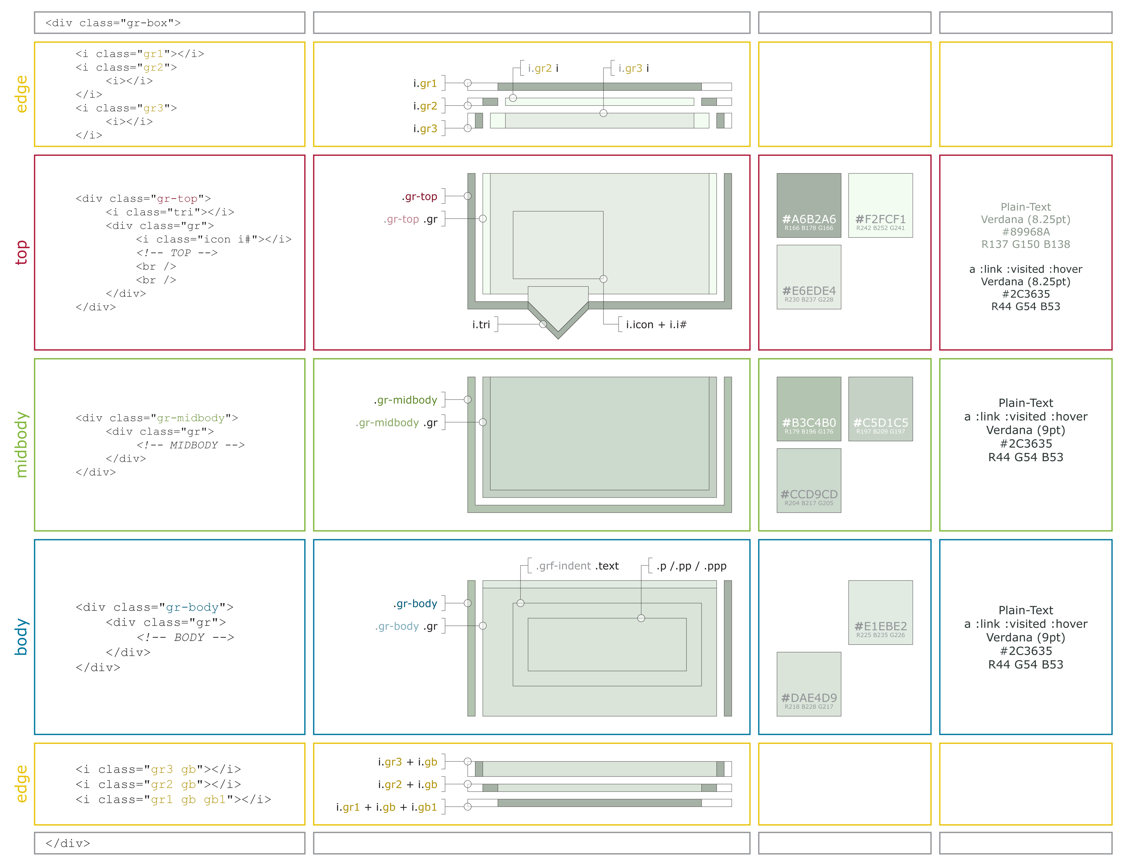
You can simply copy the code that is given in this tutorial, however to fully utilize it a basic understanding of HTML and CSS is necessary (at least knowledge of opening and closing tags and a little bit about class structure).
DeviantART uses a custom made structure, known as "Gruze", to control the modular layout of the site. For the most part, the inner workings of this system remain hidden from users, to be controlled only by the site. But, if you know where to look, and are willing to experiment, many of them can be manipulated to inject elements of dA Style into your widgets.
This tutorial is designed to go over the primary elements that make up the rounded edged box structure seen throughout the site. This code can be used in most places where you can insert text in a text-box (such as journals, widget descriptions, etc.) on your profile page. If the text-box is not editable or has a preview button, it is likely this code will not work (such as in comments).
The generic code for the box is :
As you can see, it's quite a lot of code, and rather complex at that. Some of this is do to the necessity for whitespace (such as indentation and line breaks) to be omitted (go ahead an experiment with what happens if you put each opening and closing tag on different lines). To this end, the cleaned code and its structure is shown above, and we will further talk about intricacies and variants below.
EXTERNAL (Gray)
EDGE (Yellow)
TOP (Red)
MIDBODY (Green)
BODY (Blue)
The beauty of the Gruze system is that it is completely modular. Not only can boxes be embedded within one another, each of the components of the box can be combined in any order and used interchangeably. All you have to be careful of is the end behavior, the top EDGE classes are meant to integrate with the TOP component, while the bottom EDGE classes are meant to integrate with the BODY component. Experiment with adding more internal components and omitting components. Straight edges (instead of round edges) can be created by manipulating empty components (which will span the box, but have only height enough to display their borders). Once you get a feel for the system, it is simply a matter of manipulating it to get the desired effect.
Well, there it is. I might go back in and add a little bit more about alternate means of combining the various elements. Also as I learn more about the system, I'm sure there will be more tricks I'll want to include. If this well recieved I think I could put one together for other boxes (comments, config, and the like), buttons, alternate iconsets, and other miscellaneous components. After that, perhaps an application of the schematic deconstruction to pages and community interactions in the site ... ?
EDIT : 12/1-10 1:47 PM PST
I've compressed the whitespace of the image a bit so that it should read better in deviantART (also replacing some of the colors that were more difficult to read). You should now be able to view it with readable text in normal fullview mode, no download necessary. If you would like to download it, please use the equivalent of "Download Linked File" for your browser. It does not view well embedded full size (3000+ pixels) in browser, too much scrolling is necessary. Instead view it in your local image viewer, so you can resize and navigate as needed.
I'm doing some research on alternate box types and where they work in the site for the next tutorial. After that (or perhaps a little before) will be the buttons tutorial. DeviantART uses many different button types, and most of them are still functional. Learn easy ways to control icons and text in your custom made buttons.
I really appreciate all the support this has gotten recently. If you would like to use this tutorial to make your boxes excellent I don't ask for any credit, these are hacks anyone could find by looking in the right places. However, if you do start experimenting with the system, let me know, I'd love to see what you can create (and likely learn from it too).
EDIT : 12/3-10 2:55 PM PST
So ... I guess this constitutes "well received" then.
Huge thanks to ^ginkgografix who not only chose to feature this piece, but also helped give it a bit of shine through a very helpful critique. I'm going to work on a little follow up tutorial to this one just to incorporate some of the journal specific features of the box.
If you have edits or corrections you would like to contribute to this (particularly tricks to manipulate the box), or are having difficulty getting the code to behave the way you would like, don't hesitate to contact me.
Tools :
1. Safari 5.0.2 (Develop Mode)
2. Adobe InDesign CS4
3. Adobe Photoshop CS4
Inspiration : `LostKitten + $DEVlANT + ^ginkgografix
Music : Faded Paper Figures
Time : 5 hours
.dA Piece by Piece : CSS + Box [Gruze]
You can simply copy the code that is given in this tutorial, however to fully utilize it a basic understanding of HTML and CSS is necessary (at least knowledge of opening and closing tags and a little bit about class structure).
DeviantART uses a custom made structure, known as "Gruze", to control the modular layout of the site. For the most part, the inner workings of this system remain hidden from users, to be controlled only by the site. But, if you know where to look, and are willing to experiment, many of them can be manipulated to inject elements of dA Style into your widgets.
This tutorial is designed to go over the primary elements that make up the rounded edged box structure seen throughout the site. This code can be used in most places where you can insert text in a text-box (such as journals, widget descriptions, etc.) on your profile page. If the text-box is not editable or has a preview button, it is likely this code will not work (such as in comments).
The generic code for the box is :
<div class="gr-box"><i class="gr1"></i><i class="gr2"><i></i></i><i class="gr3"><i></i></i><div class="gr-top"><i class="tri"></i><div class="gr"><i class="icon i#"></i><!-- TOP --><br /></div></div><div class="gr-midbody"><div class="gr"><!-- MIDBODY --></div></div><div class="gr-body"><div class="gr"><!-- BODY --></div></div><i class="gr3 gb"></i><i class="gr2 gb"></i><i class="gr1 gb gb1"></i></div><!-- --> are known as HTML comments, they won't render on the page. Replace these with the internal content you would like to put in each component.As you can see, it's quite a lot of code, and rather complex at that. Some of this is do to the necessity for whitespace (such as indentation and line breaks) to be omitted (go ahead an experiment with what happens if you put each opening and closing tag on different lines). To this end, the cleaned code and its structure is shown above, and we will further talk about intricacies and variants below.
EXTERNAL (Gray)
This is the foundation of the box structure, it contains all other elements of the box. While it doesn't have any physical appearance itself (it is transparent, and only serves to position internal and external tags), it is a necessary parent to some of the other classes used in the box.<div class="gr-box"></div>These tags must be included, containing ALL of the other components to ensure correct behavior.There are additional classes that can be added to this containing element to give different behavior, try including
Some classes may be used outside of the.gr-boxclass but will likely have different appearances and physical behavior..gr-genericbox,.gr-configbox, or.gr-headlessbox(each type of widget also has a.gr-[...]class assigned to it, experiment with those for different effects.) There will soon be more on alternate box types in another tutorial.
EDGE (Yellow)
The rounded edges of the box are created by a series of classes applied to three spanning<i></i>tags. They are numbered 1 - 2 - 3 to make an upward curve, and 3 - 2 - 1 to make a downward curve.<i class="gr1"></i>The top bar of the round edge, this appears as a horizontal bar, slightly shorter than the width of the box, with transparent sides.<i class="gr2"><i></i></i>This is the next element of the rounded edge, it appears as a short bar (the outline) with transparent outside. The internal <i></i> tag creates a light colored bar (giving the rounding an antialiased effect). If this internal tag is omitted, the background color will be the same as that of the BODY section of the box (to allow a smooth transition from that component).<i class="gr3"><i></i></i>This is the last piece of the rounded edge, it is similar to.gr2but with a vertical bar instead of a horizontal one. The internal tag creates two small light boxes (for the smoothing). Again, removing the internal tag, will leave the background color the same as that of the BODY component.
As of yet, the.gband.gb1currently have no physical appearance, they are used so that user created style-sheets (as used in Premium Journals) can control the lower rounded edge separate from the upper one.
TOP (Red)
The top of the box is used to hold the title of the box as well as an icon and a triangle transition glyph. It is lighter in color than the body elements of the box.The two line breaks are very important to ensure that the icon does not collapse into the next element (shifting its border to the right). Also be aware of the fact that the text in the top area is lighter colored. This is due to the fact that normally the text is included within an <h2></h2> tag set, a feature which is disabled from user-made boxes. There are alternate ways to create darker text in the title though (?).<div class="gr-top"></div>This is the containing element of the top of the box. It has a darker border (that matches the outline of the rounded edge) on the left, right, and bottom edges. It sets the internal.grclass to use the same light background as the rest of the TOP component.<i class="tri"></i>This creates the small triangle that descends into the next component. The triangle is absolute positioned relative to the bottom of the component element, it cannot be moved arbitrarily (unless placed within another element). The triangle itself is an image file (quadraforce.gif) assigned to the background of the tag.<div class="gr"></div>When used inside of the.gr-topclass this element has a light background and lighter borders on the left and right edges. This class, appearing in all of the components of the box, is the the primary internal structure. It is here that content (such as text and images), is placed.<i class="icon i#"></i>This creates an icon from the standard iconset (icons-small-modules.gif) that assigned to the background of the tag. Whatever is used to replace#determines the icon that is used, the number mapping does not match the order of the icons in the file.
For more information on icons, please see `LostKitten's 1-50 Custom Box Icon Legend and 51-100 Custom Box Icon Legend guides.
Note how the top component has a border on the bottom edge, but not the top. This allows for the rounded edge to transition smoothly with the upper rounded edge. As an experiment, try replacing the entire upper rounded component with an emptydiv.gr-toptag, to create a sharp edge with a border.
MIDBODY (Green)
This component is not often seen in widgets (most notably, it is located in the donation widget). It has a darker background than the BODY component, but functions in very much the same way.<div class="gr-midbody"></div>The containing element of the MIDBODY component, this has a dark border (though lighter than the other components) on the left, right, and bottom edges. It has a relatively dark background (that is seen through the transparent internal.grelement).<div class="gr"></div>When located within a.gr-midbodyelement, this has a light colored border on the left, right, and bottom edges. It has a transparent background.
BODY (Blue)
This is intended to be the final element of the box (it transitions into the lower rounded edge). It is also the primary location for content in the box<div class="gr-body"></div>The containing element of the BODY component, this has a dark border (though lighter than the other components) on the left and right edges (but not the bottom). It has a mid-tone background (that is seen through the transparent internal.grelement).<div class="gr"></div>When located within a.grelement, this has a light colored border on the top edge. It has a transparent background.<div class="pp"></div>This transparent structure creates text padding within an element. Use the.pand.pppclasses for different amounts of padding.
The beauty of the Gruze system is that it is completely modular. Not only can boxes be embedded within one another, each of the components of the box can be combined in any order and used interchangeably. All you have to be careful of is the end behavior, the top EDGE classes are meant to integrate with the TOP component, while the bottom EDGE classes are meant to integrate with the BODY component. Experiment with adding more internal components and omitting components. Straight edges (instead of round edges) can be created by manipulating empty components (which will span the box, but have only height enough to display their borders). Once you get a feel for the system, it is simply a matter of manipulating it to get the desired effect
.Well, there it is
. I might go back in and add a little bit more about alternate means of combining the various elements. Also as I learn more about the system, I'm sure there will be more tricks I'll want to include. If this well recieved I think I could put one together for other boxes (comments, config, and the like), buttons, alternate iconsets, and other miscellaneous components. After that, perhaps an application of the schematic deconstruction to pages and community interactions in the site ... ?EDIT : 12/1-10 1:47 PM PST
I've compressed the whitespace of the image a bit so that it should read better in deviantART (also replacing some of the colors that were more difficult to read). You should now be able to view it with readable text in normal fullview mode, no download necessary. If you would like to download it, please use the equivalent of "Download Linked File" for your browser. It does not view well embedded full size (3000+ pixels) in browser, too much scrolling is necessary. Instead view it in your local image viewer, so you can resize and navigate as needed
.I'm doing some research on alternate box types and where they work in the site for the next tutorial. After that (or perhaps a little before) will be the buttons tutorial. DeviantART uses many different button types, and most of them are still functional. Learn easy ways to control icons and text in your custom made buttons.
I really appreciate all the support this has gotten recently. If you would like to use this tutorial to make your boxes excellent I don't ask for any credit, these are hacks anyone could find by looking in the right places. However, if you do start experimenting with the system, let me know, I'd love to see what you can create (and likely learn from it too
).EDIT : 12/3-10 2:55 PM PST
So ... I guess this constitutes "well received" then
.Huge thanks to ^ginkgografix who not only chose to feature this piece, but also helped give it a bit of shine through a very helpful critique. I'm going to work on a little follow up tutorial to this one just to incorporate some of the journal specific features of the box.
If you have edits or corrections you would like to contribute to this (particularly tricks to manipulate the box), or are having difficulty getting the code to behave the way you would like, don't hesitate to contact me
.Tools :
1. Safari 5.0.2 (Develop Mode)
2. Adobe InDesign CS4
3. Adobe Photoshop CS4
Inspiration : `LostKitten + $DEVlANT + ^ginkgografix
Music : Faded Paper Figures
Time : 5 hours
Image size
3725x2875px 448.35 KB
© 2010 - 2024 ziinyu
Comments202
Join the community to add your comment. Already a deviant? Log In
Must or no premium? For make custom future.